# Overview of Project: Polling Data
In this section we're going to explore how to use matplotlib to build a number of charts on top of our poll app database.
We'll learn to build line charts, bar charts, and pie charts. We'll also learn the fundamental building blocks of a matplotlib chart so that learning more will be easier!
Here's some of the charts we'll build:
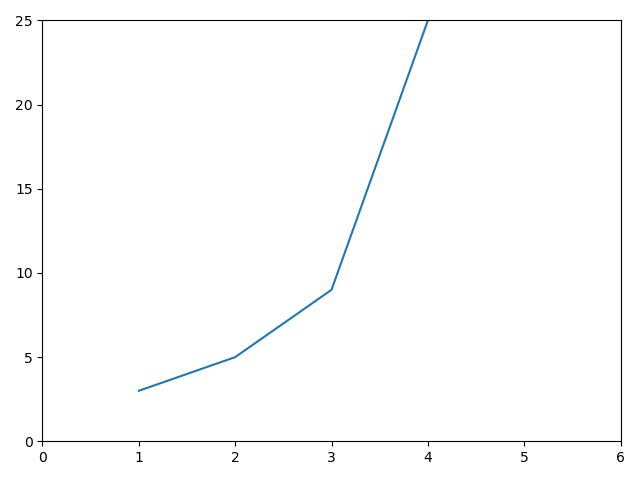
# Line chart
A simple line chart to get us started:
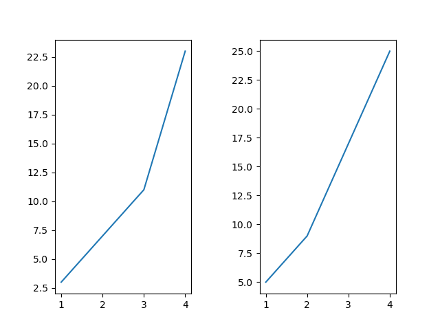
How to place multiple line charts in one image file:
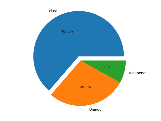
# Pie chart
We'll learn how to create simple pie charts, as well as how to display labels, percentages for each segment, and exploding certain segments to highlight them.
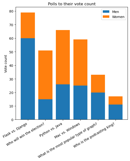
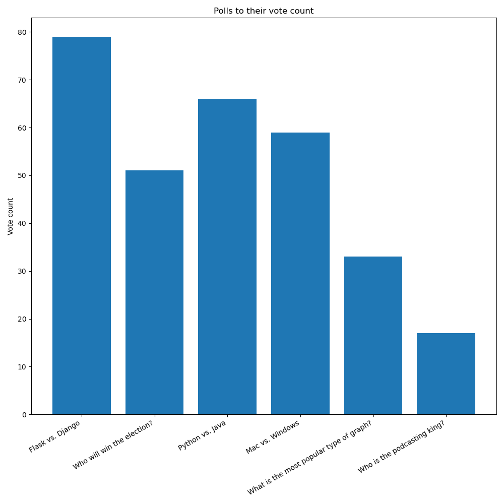
# Bar chart
We'll learn about bar charts, legends, and axis ticks:
And also a stacked bar chart: