# How to draw a pie chart with matplotlib
# A simple pie chart
We've been using .plot() to create line graphs, but matplotlib can also very easily create pie charts.
In its simplest form, a pie chart requires a list of numbers. Matplotlib then calculates what percentage each number is out of the total, and creates your pie chart with that information.
Here's a quick example:
import matplotlib.pyplot as plt

option_votes = [63, 28, 8]
figure = plt.figure()
axes = figure.add_subplot(1, 1, 1)

axes.pie(option_votes)

plt.show()
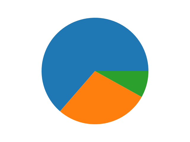
Here we've got three numbers that we're plotting: [63, 28, 8].
63is about 64% of the total.28is about 28% of the total.8is about 8% of the total.
Therefore the resultant pie chart will have segments reflecting the size of each number out of the total:
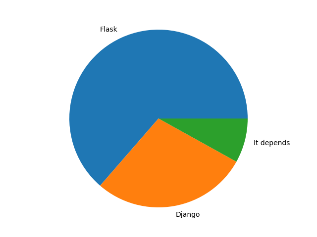
We can also add labels to each number by passing in a labels keyword argument to .pie(). There must be one label per number:
import matplotlib.pyplot as plt

option_votes = [63, 28, 8]
option_names = [
    "Flask",
    "Django",
    "It depends"
]
figure = plt.figure()
axes = figure.add_subplot(1, 1, 1)

axes.pie(option_votes, labels=option_names)

plt.show()
And the output will by default show the names beside each segment:
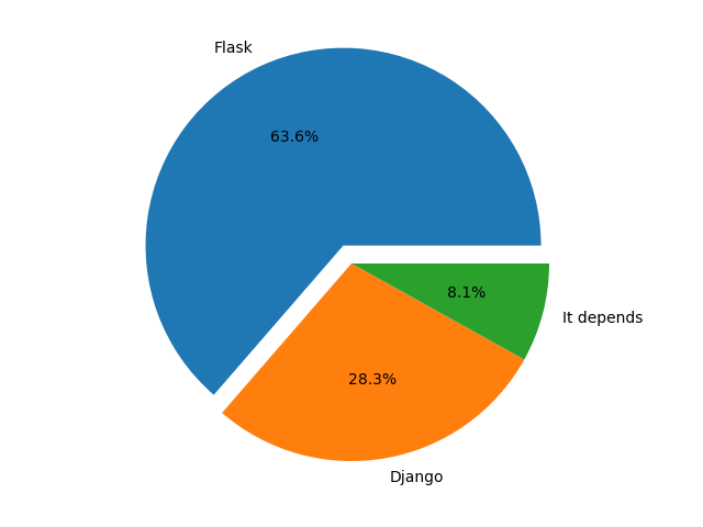
There's many more arguments we can pass in, but let's talk about two in particular:
explodewill separate a segment from the center of the pie chart.autopctwill display the percentage that each option is from the total.
import matplotlib.pyplot as plt

option_votes = [63, 28, 8]
option_names = [
    "Flask",
    "Django",
    "It depends"
]
figure = plt.figure()
axes = figure.add_subplot(1, 1, 1)

axes.pie(
    option_votes,
    labels=option_names,
    explode=[0.1, 0, 0],  # explode the first segment
    autopct="%1.1f%%"  # display percentages with 1 decimal place
)

plt.show()
The output is shown here:
# Get the required data from the database
Let's expand our app a bit more!
We'll show the user the open polls, and let them pick which poll they want to graph.
To do this, we'll need to load the data from the database. We'll need:
- A query to get the polls.
- A query to get the votes per option in the selected poll.
I'll start by creating a database.py file and writing the queries. Something like this:
SELECT_POLLS = "SELECT * FROM polls;"
SELECT_OPTIONS_IN_POLL = """
SELECT options.text, SUM(votes) FROM options
JOIN polls ON options.poll_id = polls.id
JOIN votes ON options.id = votes.option_id
WHERE polls.id = %s
GROUP BY options.id;"""
With that, we can now add our imports and connect to the database. I'll add a function to execute each query as well:
import os
import psycopg2
from dotenv import load_dotenv

load_dotenv()

SELECT_POLLS = "SELECT * FROM polls;"
SELECT_OPTIONS_IN_POLL = """
SELECT options.option_text, SUM(votes.option_id) FROM options
JOIN polls ON options.poll_id = polls.id
JOIN votes ON options.id = votes.option_id
WHERE polls.id = %s
GROUP BY options.option_text;"""

connection = psycopg2.connect(os.environ.get("DATABASE_URI"))

def get_polls():
    with connection:
        with connection.cursor() as cursor:
            cursor.execute(SELECT_POLLS)
            return cursor.fetchall()


def get_options(poll_id: int):
    with connection:
        with connection.cursor() as cursor:
            cursor.execute(SELECT_OPTIONS_IN_POLL, (poll_id,))
            return cursor.fetchall()
# Use the data to create a pie chart
Now we can go ahead and add the user interface. Let's create a new file called app.py with this content:
import database

MENU_PROMPT = "Enter 'q' to quit, or anything else to chart a new poll."
POLL_PROMPT = "Select the poll id to create a pie chart of the vote percentages."


def prompt_select_poll(polls):
    for poll in polls:
        print(f"{poll[0]}: {poll[1]}")

    selected_poll = int(input(POLL_PROMPT))
    _chart_options_for_poll(selected_poll)


def _chart_options_for_poll(poll_id):
    options = database.get_options(poll_id)
    # Draw pie chart here


while (user_input := input(MENU_PROMPT)) != "q":
    polls = database.get_polls()
    prompt_select_poll(polls)
Note that I've left a comment, # Draw pie chart here.
That's because for my charting, I'm going to create another file, charts.py. I find that keeping this separated helps with the simplicity of the code!
In charts.py I'll add:
import matplotlib.pyplot as plt

def create_pie_chart(options):
    figure = plt.figure()
    axes = figure.add_subplot(1, 1, 1)

    axes.pie(
        [option[0] for option in options],
        labels=[option[1] for option in options],
        autopct="%1.1f%%"
    )

    return figure
That's about it! It's accessing the option name and the sum of votes, and creating a pie chart!
Finally back in app.py we can make use of this, and display it:
import charts

...

def _chart_options_for_poll(poll_id):
    options = database.get_options(poll_id)
    figure = charts.create_pie_chart(options)
    plt.show()
The reason I'm calling plt.show() in app.py rather than doing it in charts.py is because I don't want charts.py to be responsible for displaying things to the user.
Now that I've got the figure in app.py, I could easily adjust the functionality to save the pie chart to a file instead of displaying a window if I wanted!