# How to draw a stacked bar chart with matplotlib
For this chapter let's assume that our poll votes also store the gender of the voter. We'll use that to chart the number of votes per poll to the genders of the voters in a bar chart.
Since our database doesn't contain the required data, in order to save you work in altering your tables and inserting new data, I'll provide some test data for you.
You can create a file called data.py and paste in the provided data:
polls = [
    ("Flask vs. Django", 60, 19),
    ("Who will win the election?", 15, 36),
    ("Python vs. Java", 26, 40),
    ("Mac vs. Windows", 25, 34),
    ("What is the most popular type of graph?", 20, 13),
    ("Who is the podcasting king?", 11, 6),
]
You'll have access to a variable, polls, which is a list of tuples. Each tuple contains the poll title, the number of male voters, and the number of female voters. For simplicity we'll leave it at that, but usually you'll be collecting more demographic information!
# Plotting the number of male votes
We know that we can plot a bar chart with two things: the x coordinates of each bar, and the y heights of each bar.
For x coordinates we'll use range(len(polls)) as we did in the previous bar chart. For the y heights we'll use the number of male votes for now. Later on we'll add female votes as well.
Let's start off with getting our poll titles and male voter data:
import matplotlib.pyplot as plt
from data import polls

poll_titles = [poll[0] for poll in polls]
poll_men = [poll[1] for poll in polls]

poll_x_coordinates = range(len(polls))
Next up, let's create our figure and add the bar chart:
import matplotlib.pyplot as plt
from data import polls

poll_titles = [poll[0] for poll in polls]
poll_men = [poll[1] for poll in polls]

poll_x_coordinates = range(len(polls))

figure = plt.figure(figsize=(6, 6))
axes = figure.add_subplot()
axes.bar(
    poll_x_coordinates,
    poll_men,
    tick_label=poll_titles
)

plt.show()
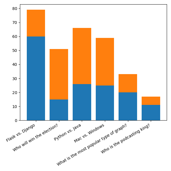
When we run this, we should see something like this:
We know how to fix the stacked labels, so let's do that at the end.
First, let's figure out how to add our female voters to the chart!
# Stacking two bar charts
We've learned that a Figure contains Axes, and inside Axes we can draw plots.
What we have to do now is draw another plot in the same pair of axes so that they'll appear together.
In addition, we must tell matplotlib that we want the female voters to appear above the male voters, and not in front of them (as then they would stop us from seeing both voters).
Here's how we can do that:
import matplotlib.pyplot as plt
from data import polls

poll_titles = [poll[0] for poll in polls]
poll_men = [poll[1] for poll in polls]
poll_women = [poll[2] for poll in polls]

poll_x_coordinates = range(len(polls))

figure = plt.figure(figsize=(6, 6))
axes = figure.add_subplot()
axes.bar(
    poll_x_coordinates,
    poll_men,
    tick_label=poll_titles
)
axes.bar(
    poll_x_coordinates,
    poll_women,
    tick_label=poll_titles,
    bottom=poll_men
)

plt.show()
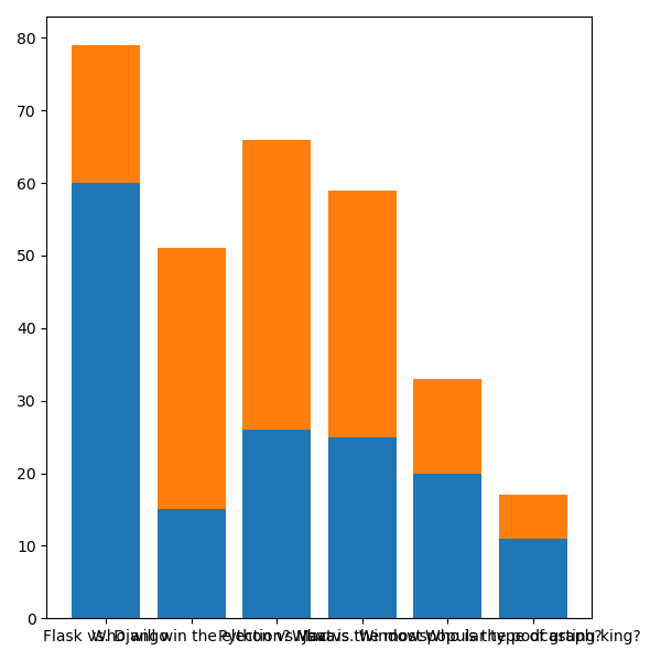
And this this, we've got ourselves a stacked bar chart!
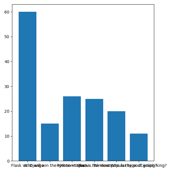
# Adjusting x ticks in multiple plots
You can see that both our plots have a tick_label= argument.
What happens when we do this is the latest argument is what will show up on the axes. In this case, since they're both the same, we don't really mind which one shows up.
However in other situations we might, so it's a bit confusing to pass the tick labels into two .bar() calls. Also, it's a bit wasteful since we have that duplication!
What we can do instead is remove the tick_label= argument from both calls, and instead use plt.xticks() to both define the labels and also specify the rotation:
import matplotlib.pyplot as plt
from data import polls

poll_titles = [poll[0] for poll in polls]
poll_men = [poll[1] for poll in polls]
poll_women = [poll[2] for poll in polls]

poll_x_coordinates = range(len(polls))

figure = plt.figure(figsize=(6, 6))
axes = figure.add_subplot()
axes.bar(
    poll_x_coordinates,
    poll_men
)
axes.bar(
    poll_x_coordinates,
    poll_women,
    bottom=poll_men
)

plt.xticks(poll_x_coordinates, poll_titles, rotation=30, ha="right")

plt.show()
Now we'll see something a bit better!

You might see the bar chart cut off at the bottom though, which is where subplots_adjust() comes into play. Let's give our x axis ticks a bit more room:
import matplotlib.pyplot as plt
from data import polls

poll_titles = [poll[0] for poll in polls]
poll_men = [poll[1] for poll in polls]
poll_women = [poll[2] for poll in polls]

poll_x_coordinates = range(len(polls))

figure = plt.figure(figsize=(6, 6))
figure.subplots_adjust(bottom=0.35)
axes = figure.add_subplot()
axes.bar(
    poll_x_coordinates,
    poll_men
)
axes.bar(
    poll_x_coordinates,
    poll_women,
    bottom=poll_men
)

plt.xticks(poll_x_coordinates, poll_titles, rotation=30, ha="right")

plt.show()
And with that, we've got our finished stacked bar chart!