# How to draw a line graph with matplotlib
To draw any graph or chart, we need to first create a Figure.
Inside a figure, we can draw graphs or charts.
In matplotlib, graphs or charts are called plots, and plots are drawn on top of axes (the plural for axis). Most plots are drawn on x and y axes, although some plots can be drawn on 3-dimensional axes as well.
The code below creates a figure with plt.figure(), plots data points using plt.plot(), and then displays the resultant graph (by default, by bringing up a window on your screen).
import matplotlib.pyplot as plt

plt.figure()
plt.plot([1, 2, 3, 4], [3, 5, 9, 25])
plt.show()
# Plotting data
plt.plot() is used to plot any arbitrary data. It automatically creates a set of 2D axes for you, and by default it produces a line graph:
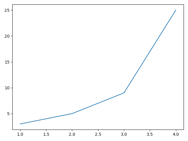
This is achieved by joining the points plotted with a straight line.
Note the first argument to .plot() is the x-axis values, and the second argument is the y-axis values.
But it can be changed[1], for example to draw circles:
import matplotlib.pyplot as plt

plt.figure()
plt.plot([1, 2, 3, 4], [3, 5, 9, 25], 'o')
plt.show()

# Using built-in colours
You can pass in a colour from the list of built-in colours[1:1] as part of the string that defines the shape of the points:
import matplotlib.pyplot as plt

plt.figure()
plt.plot([1, 2, 3, 4], [3, 5, 9, 25], 'ko')
plt.show()

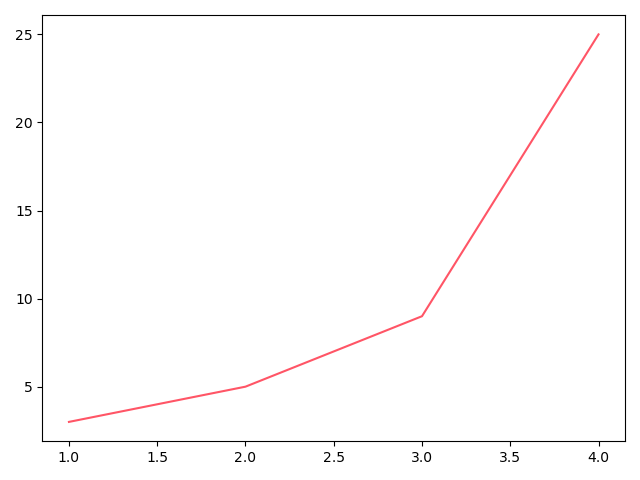
# Using custom colours
You can use custom colours by passing the colour argument separately:
import matplotlib.pyplot as plt

plt.figure()
lines = plt.plot([1, 2, 3, 4], [3, 5, 9, 25])
plt.setp(lines, color="#ff5566")
plt.show()
# Categorical variables
Instead of numbers for the x axis, you can pass in names to be used as categories:
import matplotlib.pyplot as plt

plt.figure()
plt.plot(["Men", "Women", "Children"], [3, 5, 9], 'ko')
plt.show()
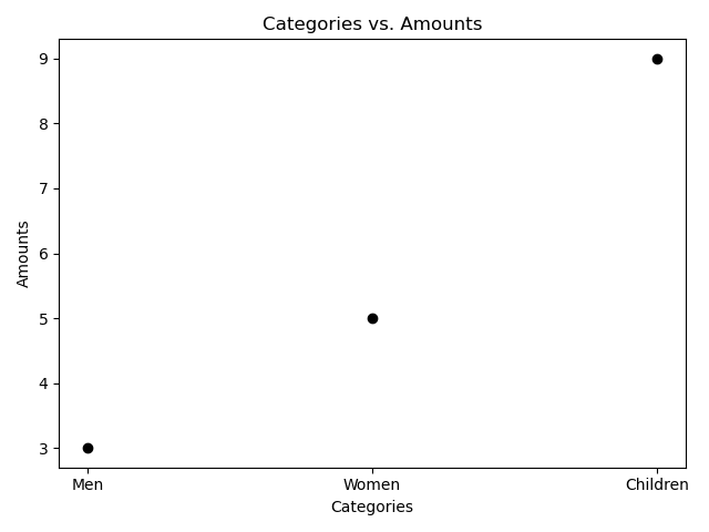
# Adding axis labels and title
We can also add axis labels with plt.xlabel("Categories") and plt.ylabel("Amounts"), for example.
A title for the graph can be added with plt.title("Categories vs. Amounts").
import matplotlib.pyplot as plt

plt.figure()

plt.xlabel("Categories")
plt.ylabel("Amounts")
plt.title("Categories vs. Amounts")

plt.plot(["Men", "Women", "Children"], [3, 5, 9], 'ko')
plt.show()