# How to adjust the size of a matplotlib plot
In this chapter we'll learn how to make figures larger or smaller, as well as how to adjust the relative sizes of different parts of a set of axes.
We had this code in the last chapter:
import matplotlib.pyplot as plt

def create_bar_chart(polls):
    figure = plt.figure()
    axes = figure.add_subplot(1, 1, 1)
    axes.set_title("Polls to their vote counts")
    axes.set_ylabel("Vote count")
    axes.bar(
        range(len(polls)),
        [poll[1] for poll in polls],
        tick_label=[poll[0] for poll in polls]
    )

    return figure
However, the resultant figure was quite small, and depending on the size of our tick labels, they might overlap with one another.
To adjust the final size of the entire figure, we can pass in dimensions to the plt.figure() call:
figure = plt.figure(figsize=(10, 10))
This gives us a 10x10 (in inches) figure. This equates to 1000x1000 pixels by default.
We can change how many pixels are in one inch with the dpi= keyword argument.
# Adjust the relative sizing of plot elements
Using figure.subplots_adjust(), we can adjust some properties of each subplot. Every adjustment ranges between 0 and 1, and they are:
left, or how far away from the left side of their bounding box they start at (smaller number means they're closer to the left).right, or how close to the right side of their bounding box they end up at (larger number means they're closer to the right).bottom, or how far away from the bottom of their bounding box they start at.top, or how close to the top of their bounding box they end up at.
By default, these are the settings:
left=0.125right=0.9bottom=0.1top=0.9
You can thing of these as margins, or gaps between the bounding box and the axes.
Since by default left=0.125 and right=0.9, that means that there is a gap of 12.5% of the bounding box that is empty on the left, and a gap of 10% of the bounding box that is empty on the right.
If you have one figure that measures 1000x1000 with one set of axes inside it, that means that you'll have:
- A left empty margin of 125px.
- A right empty margin of 100px.
- The remaining 875px will be taken up by your axes (and therefore, your plot).
The same applies for top and bottom.

WARNING
You can't have a left property greater than right, since that wouldn't make any sense! Similarly, bottom can't be greater than top.
# Adjust the relative sizing between subplots
In addition to adjusting the margins of a plot within their bounding box, you can also adjust how far subplots will be from each other, if you have more than one subplot within a figure.
This is done with the wspace and hspace arguments. By default:
wspace=0.2hspace=0.2
This means that matplotlib will take the average width of the axes, and 20% of that will be used as spacing between plots, and similarly with height.
So if you have 2 plots, each 500x500, then by default they would be separated by 100px (20% of 500).
If you increase these properties, then the spacing would change.
For example:
figure.subplots_adjust(wspace=0.5)
Now your two plots would be separated by 250px.
Here's what that looks like in a single-row set of subplots. hspace is 0 because there is only one row, but wspace is applied because there are multiple columns:

# Using this to give our bar chart more space
If your poll names are very long, the only way to let us see them well is if we rotate them, so that they'll show up like this:
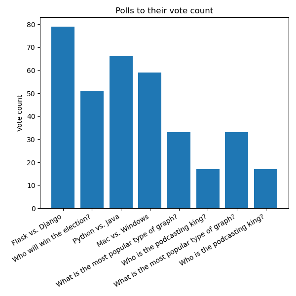
We're going to learn how to rotate the labels in the next chapter, but we will need extra space at the bottom of our chart in order to accommodate the taller labels:
import matplotlib.pyplot as plt

def create_bar_chart(polls):
    figure = plt.figure(figsize=(8, 8))
    figure.subplots_adjust(bottom=0.35)
    axes = figure.add_subplot(1, 1, 1)
    axes.set_title("Polls to their vote counts")
    axes.set_ylabel("Vote count")
    axes.bar(
        range(len(polls)),
        [poll[1] for poll in polls],
        tick_label=[poll[0] for poll in polls]
    )

    return figure
By increasing the bottom margin to 35% we add some more room for our labels. However, it does shrink our plot's size. That's why we increase the figure size as well.