# How to draw a bar chart with matplotlib
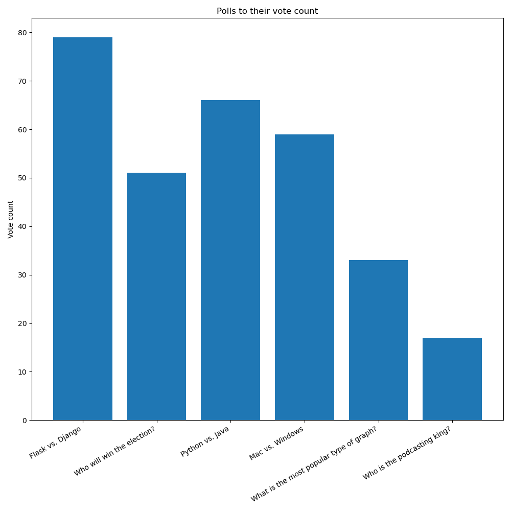
In this and the next couple chapters we're going to create a bar chart of polls to their number of votes, like this one:
In this chapter specifically we'll focus on drawing the bar chart.
Then, in next chapter we'll look at adjusting the size of the chart.
In the chapter after that we'll look at rotating the x labels and giving them more room in the figure.
# Getting the data we need
In the last chapter we looked at how to get the data we needed for our pie charts. Getting the data for our bar charts, and really the overall structure of the application, will be quite similar.
However, now we're plotting polls against their number of votes, as opposed to the votes of options within a poll.
When we're plotting separate polls, we're not plotting percentages. That's why we're going with a bar chart here instead of a pie chart.
To get the data we need, we'll adjust the query to this:
SELECT polls.name, SUM(votes) FROM polls
JOIN options ON polls.id = options.poll_id
JOIN votes ON options.id = votes.option_id
GROUP BY polls.name;
With this, I'm sure you can figure out how to change the rest of the application code to use this data in the create_pie_chart() function (which we'll rename to create_bar_chart()).
# Drawing the bar chart
Previously in charts.py we had this:
import matplotlib.pyplot as plt

def create_pie_chart(options):
    figure = plt.figure()
    axes = figure.add_subplot(1, 1, 1)

    axes.pie(
        [option[0] for option in options],
        labels=[option[1] for option in options],
        autopct="%1.1f%%"
    )

    return figure
Now we're going to make a bar chart.
Bar charts need two things:
- The coordinates of each bar in the x axis as the first argument.
- The heights of the bars (or y values) as the second argument.
These two iterables must be the same length!
Since we're getting a list of tuples from our database, where each tuple has the poll title and the sum of votes, we can actually keep things almost identical to what they are now:
import matplotlib.pyplot as plt

def create_bar_chart(polls):
    figure = plt.figure()
    axes = figure.add_subplot(1, 1, 1)

    axes.bar(
        range(len(polls)),
        [poll[1] for poll in polls],
        tick_label=[poll[0] for poll in polls]
    )

    return figure
Note we're using range(len(polls)) to generate a number sequence from 0 to len-1. That gives us an easy way to position each bar.
But now note that we don't use autopct or explode, and also the labels= keyword argument is replaced by tick_label=.
# Adding title and axis labels
Each Axes object (the subplot) can have labels for the x and y axes, and also a title. We saw this earlier on at the start of the section when we looked at drawing line graphs, and later on when we learned about the object-oriented approach in matplotlib.
Let's add these to our new graph as well:
import matplotlib.pyplot as plt

def create_bar_chart(polls):
    figure = plt.figure()
    axes = figure.add_subplot(1, 1, 1)
    axes.set_title("Polls to their vote counts")
    axes.set_ylabel("Vote count")
    axes.bar(
        range(len(polls)),
        [poll[1] for poll in polls],
        tick_label=[poll[0] for poll in polls]
    )

    return figure
If we run all this code right now though, the graph we'll get might look something like this:
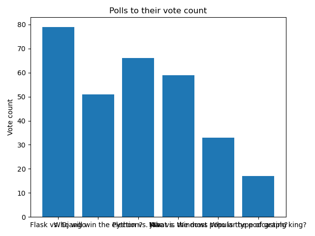
Which is far from ideal!
The labels are all stacked one on top of another because they're too long (this will depend on the polls you have created). Also, the bar chart is quite small.
By making the chart much bigger, we might avoid the problem of stacking the labels. But if the labels get even longer, that solution will not be enough.
In the next chapter we'll explore how to adjust the size of the plot!