# Matplotlib Figures, Plots, and Axes
Quick Definition
A figure contains one or more groups of axes.
Each Axes, which can be 2-dimensional or 3-dimensional, contains zero or more plots.
A plot is the thing we normally call "graph" or "chart".
# Figure
The Figure is the top level container. Inside a figure we can include one or more Axes classes, each of which can have one or more plots.
The Figure is what contains everything else, and it is also what we show when we want to display the graph to the screen:
import matplotlib.pyplot as plt

plt.figure()
plt.show()
Here we've used the pyplot library to create a new Figure. When we do this, pyplot automatically "selects" the figure, and it becomes the active figure. Every other function in the pyplot library will act on that figure until another one is selected.
But note if you run that code, you'll see no output.
The figure is empty, so matplotlib doesn't display a window.
We must first add at least a set of axes to the figure.
# Axes
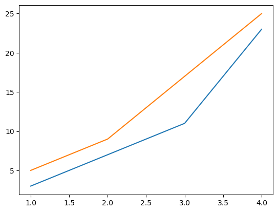
The Axes, which is a matplotlib class, is where plots are drawn. You can have multiple plots drawn on a single pair of axes, as below:
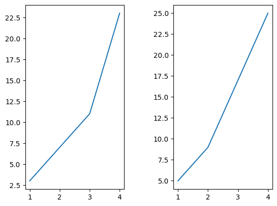
Or you can also have multiple Axes in one figure, as below:
Let's start off by adding a set of 2-dimensional axes to our figure:
import matplotlib.pyplot as plt

plt.figure()
plt.axis([0, 6, 0, 20])
plt.show()

Here we've used plt.axis() to define the values in our x and y axes. The x axis goes from 0 to 6, and the y axis goes from 0 to 20.
Note that plt.axis() acts on the currently active figure, which is the one that got created when we called plt.figure().
At the moment there's nothing drawn in the canvas though, so let's do that!
# Plot
Plots can be drawn on a set of axes, and each plot needs to specify data points for the axes that it is drawn on.
For example, if we have 2-dimensional axes, then for each data point we need to specify its x and y coordinates.
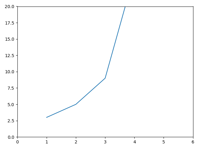
import matplotlib.pyplot as plt

plt.figure()
plt.axis([0, 6, 0, 20])
plt.plot([1, 2, 3, 4], [3, 5, 9, 25])
plt.show()
Here, we use .plot() to draw 4 points in our axes. The points drawn are:
(1, 3)(2, 5)(3, 9)(4, 25)
Note that the y axis only goes up to 20 though, so therefore this plot will be clipped at 20 in the y axis, and it won't be shown in its entirety:
If we don't specify the axes dimensions ourselves, .plot() will do it for us based on the provided data:
import matplotlib.pyplot as plt

plt.figure()
plt.plot([1, 2, 3, 4], [3, 5, 9, 25])
plt.show()
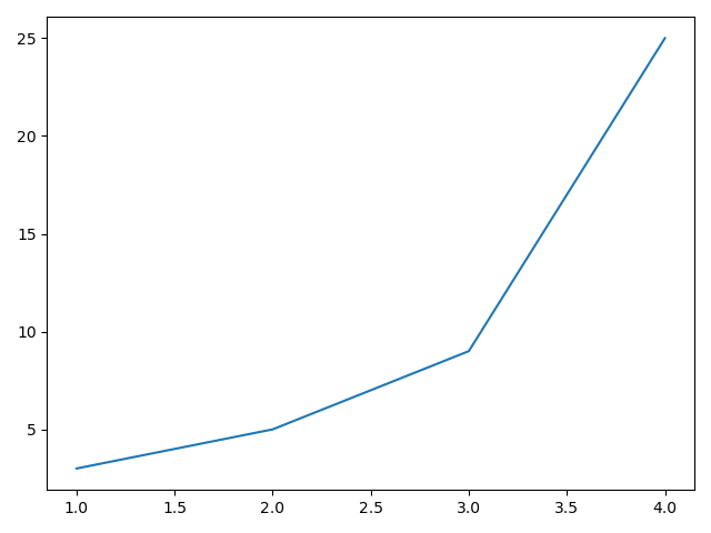
Note the y axis here goes to 25, since that's the maximum value in our data set.