# How to create a custom legend with matplotlib
We've learned how to create legends for our charts using either labels in each plot, or by manually assigning labels to plots.
Using a label in each plot we did something like this:
...

axes.bar(
    ...
    label="Men
)
axes.bar(
    ...
    label="Women"
)

axes.legend()

...
Manually assigning labels to plots happened like this:
...

men = axes.bar(...)
women = axes.bar(...)

axes.legend((men, women), ("Men", "Women"))

...
# Creating custom legends
Sometimes though, we want to create custom legends that don't necessary map to individual plots.
For example, if we create a single bar chart but we pass in multiple colours so that different bars are coloured differently:
import matplotlib.pyplot as plt

figure = plt.figure()
axes = figure.add_subplot()

axes.bar(
    range(6),
    [150, 90, 78, 55, 123, 190],
    tick_label=["Apple", "Burberry", "Google", "Zara", "Microsoft", "Superdry"],
    color=["#5c44fd", "#ff5566", "#5c44fd", "#ff5566", "#5c44fd", "#ff5566"]
)

plt.xticks(rotation=30, ha="right")
plt.show()
This produces a bar chart like this one:
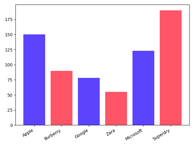
It would be nice if we could have a legend that maps blue to tech, and red to clothing companies. But since this is a single plot, neither of the approaches we covered earlier on would work.
That's where custom legends come into play!
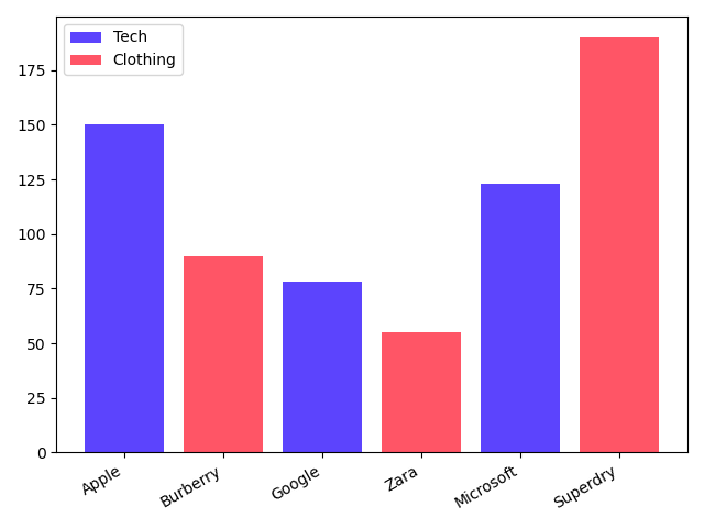
# Creating a custom colour Patch
Each legend element (also called 'handle') is composed of two things: a patch of colour that tells us which plotted element the legend is for, and a label.

To create a custom legend, we first need to create those standalone patches of colour. We do with with the Patch class:
from matplotlib.patches import Patch

handles = [
    Patch(facecolor="#5c44fd", label="Tech"),
    Patch(facecolor="#ff5566", label="Clothing")
]
# Using the patches in a custom legend
Then we can use those handles in a custom legend, like so:
plt.legend(handles=handles)
Easy enough!
The complete code looks like this:
import matplotlib.pyplot as plt
from matplotlib.patches import Patch

figure = plt.figure()
axes = figure.add_subplot()

axes.bar(
    range(6),
    [150, 90, 78, 55, 123, 190],
    tick_label=["Apple", "Burberry", "Google", "Zara", "Microsoft", "Superdry"],
    color=["#5c44fd", "#ff5566", "#5c44fd", "#ff5566", "#5c44fd", "#ff5566"]
)

handles = [
    Patch(facecolor="#5c44fd", label="Tech"),
    Patch(facecolor="#ff5566", label="Clothing")
]

axes.legend(handles=handles)

plt.xticks(rotation=30, ha="right")
plt.show()
And the result: